Is skeuomorphism back on the menu?
tl;dr: Yes
And it's about time! They say the pendulum swings every twenty years or so, and that trends in design and fashion are bound to repeat themselves. So today I'm going to share some very personal opinions about WWDC25, as an observer who truly enjoys designing user interactions, reading up on UI/UX, and exploring its history.
I'd like to start by saying that I'm not a UI/UX expert. I'm just a mercenary software engineer by day and an hobbist, lone-coder at night. I was first exposed to UI/UX concepts and theory during my compsci studies at university, in one of my exams, but that's about it. In my day job, I work closely with several UI/UX teams to fit their design ideas within the constraints of our tech stack. That's the extent of my professional experience in the field.
So after all that preamble, I’d say WWDC25 proves the point: skeuomorphism, and the use of UI elements that mimic real-world materials and objects, has indeed made a comeback, in some shape or form. To be honest, though, it's been slowly creeping back for a few years now.
 (Airbnb top menu - June 2025)
We can see this in many examples even the current macOS Sequoia and iOS 18 present traits of skeuomorphism. Notice the slow and silent changes in the main system icons, they started to inject way more shadows and depths in the last few releases. Buttons appeared way more "clickable" than what we were used to from the introduction of the stern and minimalist flat design. Look at the Airbnb website, it even shows some very hyper realistic icons on the top of the page. Or one more example could be the new Spotify Mix feature and the interesting styling choice for two buttons in the UI:
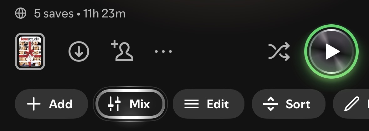 (Spotify Mix - Sept 2025)
I started noticing this trend ever since a meme design style called Neumorphism appeared on Dribbble years ago. I think people were seeking an alternative to the prevailing flat UIs and wanted more playful interactions that provided instant feedback. I really digged it. But my only negative takeaway about neumorphism was that almost everything looked ridiculously like buttons, even static divs and containers, so the clicking affordance was everywhere. In general, for years now, I think we've been in desperate need of something that clearly screams, "Hey, I'm actually a button, click me!" not just a dull colored superellipse button that uselessly delays the gulf of evaluation and interaction by a few seconds.
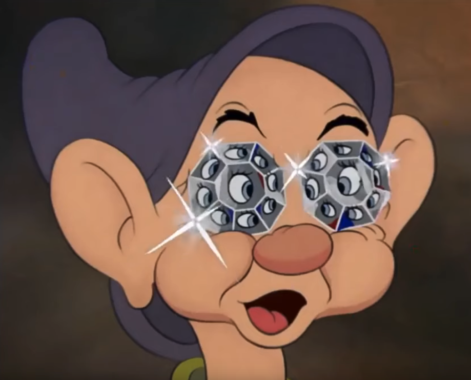
After scrolling on Bluesky/Twitter, I found a plethora of fantastic memes about Liquid Glass. I also read many subtle jokes about how Steve Jobs would have fired everyone if he had seen what Liquid Glass would look like. I mean, just look at what the Developer Preview of Mac OS X looked like when it was released:
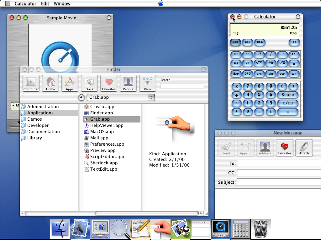 (Courtesy of GUIdebook)
While I can't really speak for someone who's sadly passed away, I don't think that's true. It took Mac OS X and Aqua years of iteration before achieving something truly stunning like Leopard and Lion, which, in my humble opinion, were the peak of Apple's UI/UX. Many people are judging the Beta preview of Tahoe very negatively. Some of that feedback will surely be taken into consideration before the general availability, but I also believe it will take a few releases before Apple figures out how to solidify this very malleable Liquid Glass.
Why does everyone always talk about new Apple releases? What's with all the negativity? Well, this is what happens when you position yourself as the industry standard for products that had huge attention to details and thoughtful user experiences. This is a very tangible feeling when using Apple software and hardware. While this is still partially true today, in recent years I've seen an unfortunate slow decline.
The thing that annoys and scares me the most is going to be the inevitable bloat!
This new UI refactoring will surely bring a significant hit to the performance of the system. I've been expecting this ever since the M1 chip was released. In my head, I thought this was basically free real estate for developers, and it would only be a matter of time before they started clogging the whole OS with useless computations. If we developers are notoriously shit at optimizing apps, putting Chromium everywhere, just imagine how a bloated base OS would affect the overall experience. Maybe flat design wasn't so bad after all.
I genuinely wonder what's going to happen to all these MacBooks without a fan in two or three years' time. I guess we'll know how to warm our thighs during winter...
But you know what? I'm actually happy about this change. I never liked flat design and have been actively against it from day one. When OS X Yosemite came out, I remember telling a good friend of mine, "This looks like an operating system made by Chicco" (if you're Italian you should get the joke, otherwise google it to have an idea).
There are many great write-ups explaining why flat design simply didn't work. Will we ever break the 20-year cycle of design repetition? How do we start inventing the future again, like what was promised in the Y2K aesthetic? Maybe it will take another war or revolution to shake up society and design culture. Perhaps in 15 or 20 years, I'll write a new blog post about how somehow, flat design returned...
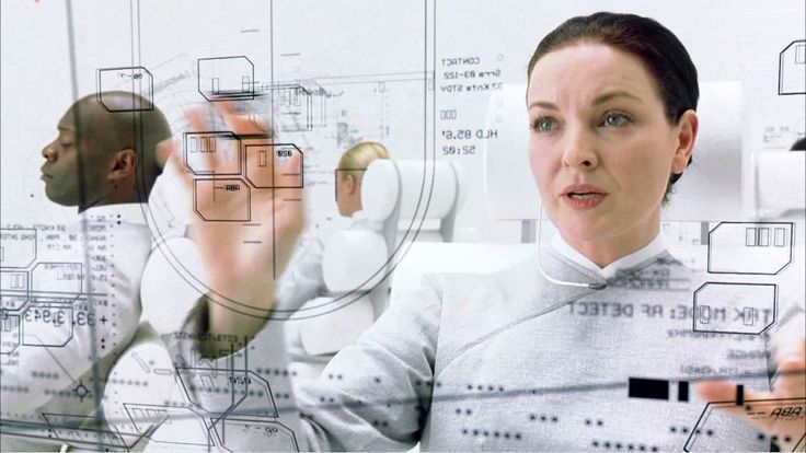 (Matrix Zion Control)
Generative AIs could be one of those game-changers though. An eerie theory I read a few months ago was: What if UI and frontend technologies gradually lose their importance in the future? With the rise of large language models, these systems are already positioning themselves between users and information, taking on tasks of data processing, filtering, summarization, and more. LLMs could simply query most of the data from APIs and backends, then spit it out directly, effectively replacing the polished frontend layer we rely on today. Maybe they'll help us cut through the clutter of notifications and endless doomscrolling. Maybe we'll go back to barebones, minimalistic geometric shapes (like in the Matrix Zion Control scene), and everything will be done through speech commands. In that case, I'd better start improving my English accent.